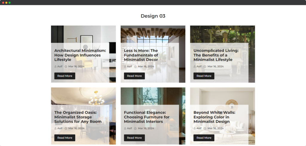
The Divi Post Grid module allows you to display your WordPress posts in a grid format, making it visually appealing and easy for users to navigate through your content. It offers various customization options to control the layout, post types, and display elements, enhancing the overall presentation of your posts on the website.

Live Demo of the Post Grid module
Content
This tab allows you to configure the specific posts to display, set filtering options, and customize various content-related settings for the grid layout.
Query
- Post Type – This option allows you to specify the type of posts you want to display, such as standard posts, pages, or custom post types.
- Included Category – You can select specific categories to include in the display, allowing you to showcase content from particular topics or areas of interest.
- Order By – This setting determines the criteria by which posts are sorted, such as date, title, or custom fields.
- Sorted By – This option defines the order direction, whether ascending or descending, for the posts displayed based on the selected criteria.
- Post Limit – You can set a limit on the number of posts displayed in the grid, helping to manage content visibility and layout.
- Date Format – This allows you to customize how the date is presented for each post, ensuring consistency with your site’s design.
- Post Offset Number – This setting enables you to skip a specified number of posts before starting to display, useful for pagination or specific content arrangements.
- Include posts by IDs – You can manually include specific posts by entering their IDs, allowing for targeted content display.
- Exclude posts by IDs – This option lets you specify posts to exclude from the grid by entering their IDs, giving you control over the displayed content.
Layout Settings
- Template Layout – Choose the overall layout style for displaying posts within the grid.
- Number of Columns – This responsive setting determines how many columns the posts will be displayed in, adjusting based on the screen size.
- Column Gap Left/Right – Adjusts the horizontal spacing between columns to enhance visual separation.
- Column Gap Top/Bottom – Sets the vertical spacing between rows of posts, helping to create a balanced layout.
- Equal Height – Ensures all posts in the grid have the same height for a uniform appearance.
- Show Avatar – Option to display the author’s avatar next to the post, enhancing author recognition.
- Show Image – This option allows the featured image of the post to be displayed within the grid.
- Image Size – Select the dimensions of the images to control how they appear in the grid.
- Show Title – Option to display the title of each post, providing a clear heading for each entry.
- Show Excerpt – Allows a brief summary or excerpt of the post to be shown, giving readers a preview of the content.
- Excerpt Length – Sets the number of words or characters for the post excerpt, controlling its brevity.
- Show Categories – Option to display the categories assigned to each post for better content organization.
- Show Single Categories – Controls whether to show a single category for each post, enhancing focus on specific topics.
- Show Single Category – If enabled, displays the name of the single category a post belongs to.
- Show Author – Option to display the author’s name alongside the post, enhancing author visibility.
- Show Date – Allows the publication date of each post to be shown, providing context for the content.
- Pagination – Enables pagination for the grid, allowing users to navigate through multiple pages of posts.
Design
This tab provides options to customize the visual appearance of the post grid, including styles, spacing, and alignment to enhance the overall look and feel of the module.
Post Grid Style
Select the overall visual style for the grid layout, determining how posts are arranged and displayed. This option can include various layouts such as traditional, modern, or custom designs, enhancing the site’s aesthetic appeal and user experience.
Thumbnail Style
Content Box
Choose how the thumbnail images will be presented, affecting their appearance within the grid. Options may include cropping, maintaining aspect ratio, or custom sizes, allowing for a visually consistent presentation across different posts.
Post Title
Customize the appearance of the post titles, including font size, weight, and color to enhance visibility. You can also choose text transformations and hover effects to make the titles more engaging for users.
Post Excerpt
Style the excerpt text, allowing adjustments to font size, color, and line height for better readability. This is crucial for ensuring that users can quickly grasp the content’s essence before deciding to read more.
Category
Modify the styling of the category labels displayed with the posts, including color and font attributes. This helps categorize posts effectively and can enhance the overall look by matching the site’s branding.
Author
Adjust the appearance of the author name, allowing customization of font style and size for better integration. This feature can help in creating a more personalized experience for visitors by acknowledging contributors.
Date
Style the date display, enabling changes to font size, color, and format to suit the overall design. This is important for indicating post recency and can be styled to match the theme or to stand out.
Readmore
Customize the button or link for “Read More,” including its text, style, and hover effects to enhance user engagement. This option allows you to attract attention and encourage users to click through to read the full article.
Pagination
Style the pagination controls, allowing adjustments to layout, spacing, and visual elements for navigation between pages. You can customize the look of previous/next buttons and the overall pagination layout to improve usability and accessibility.