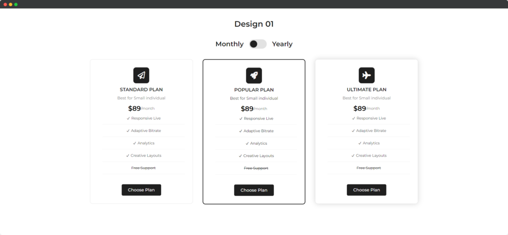
The Divi Content Toggle module for Divi Builder allows you to create interactive sections where users can switch between different pieces of content, such as tabs or accordions. This is useful for organizing large amounts of information into manageable and user-friendly sections.

Live demo of the Content Toggle module.
Content
Content tab of the Content Toggle module.
Primary
- Use Title – Determines whether to display a title for the Primary content toggle section.
- Heading – Defines the heading for the Primary content toggle section.
- Content type – Specifies the type of content that will be displayed within the toggles.
- Content – Divi text editor supported text field for the Primary toggle.
Secondary
- Use Title – Determines whether to display a title for the Secondary content toggle section.
- Heading – Defines the heading for the Secondary content toggle section.
- Content Type – Specifies the type of content that will be displayed within the toggles.
- Content – Divi text editor supported text field for the Secondary toggle.
Design
Design tab of the Content Toggle module.
Switcher
Customize the appearance of the switcher element that allows users to toggle between primary and secondary content.
Switcher Title
Style the text of the switcher title, which indicates the type of content being displayed.
Primary Content
Adjust the design of the primary content that is shown by default when the switcher is in its initial position.
Secondary Content
Customize the design of the secondary content that is shown when the switcher is toggled.
Heading Text
Style the heading text for the content toggle module to ensure it stands out and fits with your website’s design.