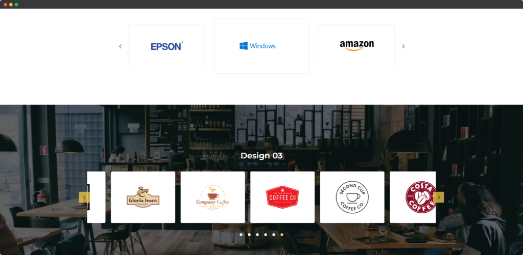
The Divi Logo Carousel module for Divi Builder allows you to display a rotating carousel of logos on your website. This module is ideal for showcasing clients, partners, sponsors, or brands associated with your business. The carousel can be customized to fit your site’s design, providing a visually appealing way to build credibility and highlight important affiliations.

Live demo of the Logo Carousel
Content
Add New Logo
- Upload Logo – This option allows you to upload the logos you want to display in the carousel. Each logo can be uploaded individually, ensuring that the images are high-quality and appropriately sized for the carousel display.
- Logo Alt Text – Logo Alt Text lets you add descriptive text for each logo, which is important for accessibility and SEO. The alt text helps screen readers describe the logos to visually impaired users and provides search engines with context about the logos.
- Use Link – This setting allows you to add a clickable link to each logo in the carousel. By enabling this option, users can be directed to a specific URL when they click on a logo, making the carousel not only a visual showcase but also an interactive navigation element.
Logo Settings
- Height – This setting allows you to specify the height of each logo slide within the carousel. Adjusting the height ensures that all logos fit within the desired vertical space, maintaining consistency and aligning with your overall design.
- Width – The Width option lets you define the width of each logo slide, giving you control over how much horizontal space each logo occupies. By setting the width, you can ensure that the logos are displayed at the right size, whether you prefer a compact or more expansive layout.
- Hover Animation – Hover Animation allows you to apply an animation effect to the logos when users hover over them. This interaction can make the logos more engaging by adding movement or visual effects, drawing attention, and creating a more dynamic user experience.
Carousel
On the General Tab
- Animation Speed – This setting allows you to control how quickly the logos transition from one to the next in the carousel. Adjusting the animation speed can create a smooth, fast, or leisurely visual experience, depending on the effect you want to achieve.
- Autoplay – The Autoplay option enables the logo carousel to automatically start rotating through the logos without user interaction. This feature keeps the carousel in constant motion, drawing attention to the logos as users browse your site.
- Autoplay Speed – This option lets you set the duration between each slide transition when Autoplay is enabled. Adjusting the autoplay speed helps you control the rhythm of the carousel, ensuring it moves at a pace that matches your site’s overall tempo.
- Use Navigation – This setting allows you to include navigation arrows on the carousel, giving users manual control over the logo rotation. Navigation arrows help visitors scroll through the logos at their own pace, enhancing user interaction.
- Use Pagination – The Use Pagination option adds pagination dots below the carousel, indicating the number of slides and the user’s current position. Pagination dots provide an easy way for users to navigate through the carousel and keep track of where they are.
- Use Fixed Width Slide – This option enables you to set a fixed width for each logo slide in the carousel. By using fixed-width slides, you can ensure consistency in the logo sizes, which helps maintain a uniform and professional appearance.
- Slide To Show – This setting lets you determine the number of logos displayed at one time within the carousel. Adjusting the number of visible slides can create different visual effects, such as showing a dense lineup of logos or a more spacious display.
- Slide Spacing – Slide Spacing allows you to adjust the amount of space between each logo in the carousel. This option helps you control the overall layout and ensures the logos are appropriately separated for better visual clarity.
- Apply Spacing on First & Last Item – This setting determines whether the spacing between slides is applied to the first and last logos in the carousel. Enabling this option ensures that all logos are evenly spaced, creating a balanced and polished look.
- Infinite Looping – Infinite Looping makes the carousel continuously cycle through the logos without stopping, even after reaching the end. This option ensures that the logo display remains dynamic and uninterrupted, keeping the visual flow consistent for users.
On the Advanced Tab
- Sliding CSS Transition – This option allows you to choose the type of CSS transition effect that occurs when the logos slide from one to the next. By selecting a specific transition, you can create a smooth and visually pleasing animation that enhances the overall user experience.
- Swipe – The Swipe option enables touch and mouse swipe functionality for the logo carousel. When enabled, users can manually swipe or drag the carousel to scroll through logos, providing a more interactive and user-friendly experience, especially on mobile devices.
- Items to Scroll – This setting determines the number of logos that scroll at one time when the carousel advances. You can set it to scroll one item at a time or multiple items, depending on how you want the carousel to behave when users interact with it.
- Vertical Mode – Vertical Mode allows you to display the logo carousel in a vertical orientation instead of the traditional horizontal layout. This setting is useful for designs where vertical scrolling or stacking logos is more visually appropriate.
- Center Mode – Center Mode highlights the center logo in the carousel by giving it prominence, such as by enlarging it or applying additional styling. This feature draws attention to the central logo and creates a focal point within the carousel.
- Wait For Animate – This option ensures that the carousel waits for the current slide animation to complete before allowing any further interaction. Enabling this feature helps maintain smooth transitions and prevents overlapping animations, resulting in a more polished experience.
- Wrapper Spacing Top – Wrapper Spacing Top allows you to add space above the entire logo carousel. Adjusting this spacing helps to position the carousel correctly within your layout, ensuring it has enough breathing room and doesn’t feel cramped against other elements.
- Wrapper Spacing Bottom – Wrapper Spacing Bottom lets you add space below the logo carousel. Similar to the top spacing, this setting ensures that the carousel is visually balanced and comfortably separated from other page elements.
Design
Arrows
The Arrows design options allow you to customize the appearance of the navigation arrows in the logo carousel. You can adjust their size, color, positioning, and style to ensure they are clearly visible and match the overall design of your site, making it easy for users to navigate through the carousel.
Pagination
The Pagination design settings let you style the pagination dots that appear below the carousel. You can control the size, color, and spacing of the dots, ensuring they complement the carousel’s design and provide clear visual cues for users to track their position within the carousel.
Text
The Text design options provide control over any text associated with the logo carousel, such as labels or captions. You can customize the font, color, size, and alignment to ensure the text is readable and integrates well with the overall design of the carousel.
Sizing
The Sizing settings allow you to adjust the overall size of the elements within the carousel, including the logos, arrows, and pagination. By fine-tuning the sizing, you can ensure that the carousel fits perfectly within your page layout and that all elements are proportionate and visually balanced.


