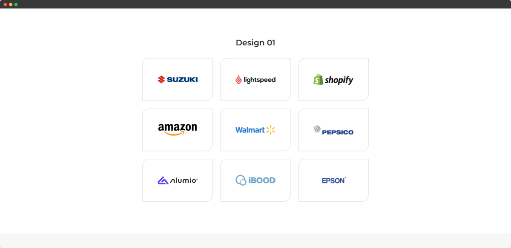
The Divi Logo Grid module for Divi Builder is designed to display a collection of logos in a grid layout on your website. This module is ideal for showcasing clients, partners, sponsors, or any other group of logos you want to present in a clean and organized manner. The grid format allows you to display multiple logos simultaneously, making it a great option for building credibility and highlighting important affiliations in a visually appealing way.

Live Demo of the Logo Grid module.
Content
Add New Logo
Click the Add New Logo
- Upload Logo – This option allows you to upload individual logos that will be displayed in the grid. Each logo can be added separately, ensuring that all images are optimized for clarity and fit perfectly within the grid layout.
- Logo Alt Text – Logo Alt Text provides an opportunity to add descriptive text for each logo. This text is important for accessibility, helping screen readers describe the logos to visually impaired users, and also contributes to better SEO by giving search engines context about the logos.
Settings
- Columns – This setting allows you to specify the number of columns in the logo grid, determining how many logos will be displayed side by side. Adjusting the number of columns helps you control the layout and overall presentation, making sure the grid fits well within the page design.
- Columns Height – The Columns Height option lets you set the height of each column in the grid, ensuring uniformity across the logos. This helps create a consistent appearance, especially when logos vary in size or aspect ratio, maintaining a clean and balanced grid.
- Columns Gap – Columns Gap allows you to control the amount of space between each column of logos in the grid. Adjusting the gap ensures that the logos are properly spaced, preventing them from appearing too crowded or too far apart, which enhances the overall visual appeal.
- Logo Size – The Logo Size setting lets you adjust the size of each logo within the grid, ensuring they are displayed at the appropriate scale. This helps create a harmonious visual presentation where all logos are clearly visible and proportionate to each other.
- Hover Animation – Hover Animation adds interactive effects to the logos when users hover over them. This can include animations like zooming, fading, or shifting, which make the grid more engaging and visually dynamic, drawing attention to each logo.
- Logo Overflow – Logo Overflow controls how logos behave if they exceed their designated grid space. By adjusting this setting, you can determine whether the logos should be cropped to fit the grid or allowed to overflow, ensuring that the grid layout remains tidy and consistent.
Design
Text
The Text toggle in the Design tab allows you to customize the appearance of any text related to the logos in the grid, such as captions, labels, or descriptions. You can modify the font style, size, color, letter spacing, and alignment to ensure the text complements the logos and fits the overall design aesthetic.
Sizing
The Sizing toggle provides options to adjust the dimensions of the logos within the grid. You can control the width and height of the logos to ensure they are consistently sized, creating a balanced and uniform grid layout. This ensures that the logos fit perfectly within their designated spaces, enhancing the overall visual appeal.
Spacing
The Spacing toggle allows you to manage the spacing around and between the logos in the grid. You can adjust the margin, padding, and gutter spacing to create the desired amount of space between each logo and between the grid and surrounding elements. Proper spacing ensures the grid doesn’t appear cluttered and maintains a clean, organized look.


