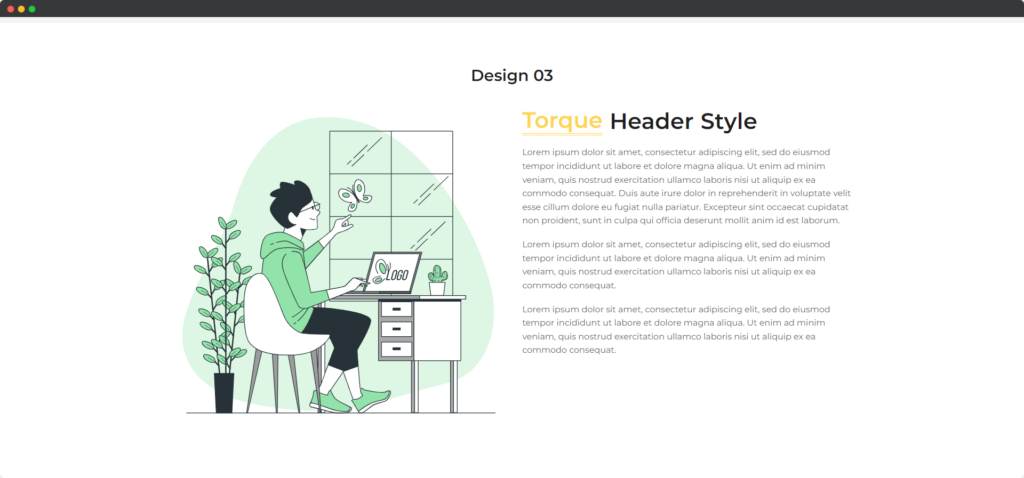
The Divi Heading Module for Divi Builder is a versatile tool for adding and styling headings on your Divi web pages. It allows you to create impactful and visually appealing headings that enhance the overall design and readability of your content.

Live Demo of the Heading Module
Content
Content
- Before Text – Text that appears before the main heading, is often used to provide context or additional information. You can style this text separately to ensure it complements the main heading.
- Center Text – The main heading text that you want to emphasize. This is the focal point of the heading module and can be customized in terms of font, size, color, and style.
- After Text – Text that appears after the main heading, is useful for supplementary information or a subtitle. Like the before text, it can be styled differently to distinguish it from the main heading.
- Background Text – A background text that appears behind the main heading, adding a decorative or contextual element.
- Link URL – A background text that appears behind the main heading, adding a decorative or contextual element.
- HTML Tag – Select the appropriate HTML tag for the heading (H1, H2, H3, etc.). This helps with SEO and ensures the heading fits correctly within the structure of your webpage.
Design
General
The General settings in the design tab allow you to control the overall appearance and layout of the heading module. This includes options like background color, gradient, and border settings. You can also adjust the spacing around the heading, such as margins and padding, to ensure it fits well within your page layout.
Text
The Text settings provide options for customizing the font, size, color, and style of all text within the heading module. You can set global text properties that apply to all text elements, ensuring consistency. Additionally, you can adjust line height, letter spacing, and text alignment to improve readability and aesthetic appeal.
Before Text
The Before Text settings specifically target the text that appears before the main heading. You can customize its font, size, color, and other styling options independently from the main heading text. This allows you to highlight or differentiate this text to add context or additional information effectively.
Center Text
The Center Text settings are dedicated to the main heading text. Here, you can choose from a wide range of font options, adjust the size, weight, and style, and set the text color. You can also apply text shadows and other effects to make the main heading stand out prominently.
After Text
The After Text settings control the text that appears after the main heading. Similar to the Before Text settings, you can independently customize its font, size, color, and other style properties. This helps in adding supplementary information or a subtitle that complements the main heading.
Background Text
The Background Text settings allow you to add and style text that appears behind the main heading, creating a layered effect. You can set the font, size, color, and opacity to ensure the background text is visible but not overpowering. This can be used for decorative purposes or to add a subtle contextual element.
Highlighter
The Highlighter settings enable you to add a highlight effect to specific parts of your text, usually the main heading. You can customize the highlight color, style, and opacity to draw attention to important words or phrases. This feature helps in emphasizing key points and making the heading more visually engaging.