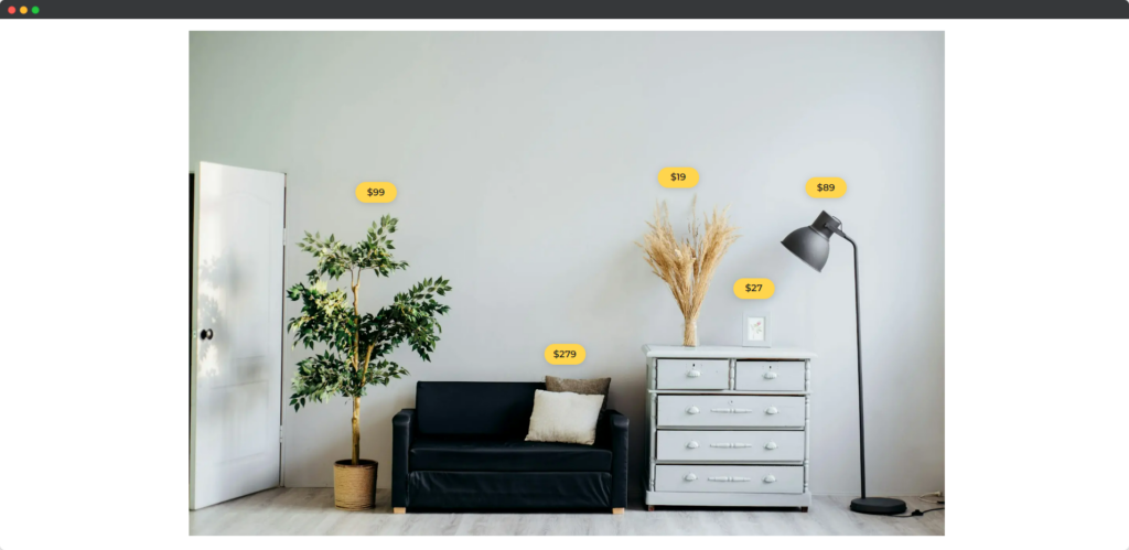
The Divi Hotspot Module for Divi Builder is a versatile tool that allows you to create interactive images on your Divi website. By adding hotspots (clickable or hoverable points) to an image, you can enhance user engagement by revealing additional information, such as text, images, or links, when users interact with these hotspots.

Live Demo of the Hotspot Module
Content
Content tab of the Hotspot Module.
Add New Hotspot
Click the plus (+) Icon to add a new hotspot item.
Spot
- Spot Type – The “Spot Type” setting allows you to choose the style of the hotspot marker on your image.
- Select Icon – It lets you choose a specific icon to represent the hotspot marker if you have selected the icon.
Tooltip
- Media Type – The option allows you to choose the type of media (image or icon) that will appear in the tooltip when the hotspot is activated.
- Title – This title acts as the main descriptor for the information provided, drawing users’ attention and giving them a clear idea of what the tooltip is about.
- Description – This content should provide users with relevant information related to the hotspot, making the tooltip a useful source of additional insights or context.
- Use Button – The “Use Button” option enables the inclusion of a button within the tooltip, allowing users to take action directly from the tooltip.
Settings
Settings have two tabs –
Spot (tab of the Settings)
- Use Animation – This allows you to add an animated effect when the tooltip appears, enhancing user interaction and drawing attention to the hotspot.
- Vertical Position – It lets you adjust the tooltip’s position on the vertical axis, allowing you to control whether it appears above or below the hotspot marker.
- Vertical Offset – This option allows you to fine-tune the tooltip’s vertical position by adjusting its distance from the original vertical position.
- Horizontal Offset – It enables you to adjust the tooltip’s position on the horizontal axis, moving it left or right relative to the hotspot marker.
Tooltip (tab of the Settings)
- Trigger Event – This option determines how the tooltip is activated, whether by a hover, click, or other user interaction. This setting controls when the tooltip content is revealed to the user.
- Placement – It allows you to choose where the tooltip appears in relation to the hotspot, such as above, below, to the left, or to the right.
- Animation – The “Animation” option lets you select the type of animation that plays when the tooltip appears, adding a dynamic effect that can make the tooltip more engaging and visually appealing.
- Use Arrow – The “Use Arrow” option enables an arrow pointing from the tooltip to the hotspot, helping to visually connect the tooltip content with the relevant spot on the image.
Image
- Upload Image – It allows you to add an image to the tooltip, providing a visual element that complements the text content. This image can enhance the information presented in the tooltip, making it more engaging and informative for users.
- Image Alt Text – This lets you provide descriptive text for the uploaded image, improving accessibility for users with visual impairments and aiding in SEO by giving search engines context about the image content.
Design
Design tab of the Hotspot Module.
Spot
You can adjust the size, color, and shape of the spot to ensure it stands out and is easily noticeable by users. Additionally, you can add effects like shadows or borders to make the spot more prominent. This customization helps in creating a visual cue that effectively grabs attention and guides users to interact with the hotspot.
Spot Text
The “Spot Text” design settings control the styling of any text associated with the hotspot marker itself, such as labels or tooltips that appear directly next to the spot. You can modify the font type, size, color, and alignment to match the overall design of your site. Ensuring that the text is readable and visually appealing is important for maintaining user engagement and effectively conveying the intended message.
Tooltip Media
The “Tooltip Media” design options let you style the media content (like images or videos) that appears within the tooltip when the hotspot is activated. You can adjust the size, borders, and spacing of the media to make it visually cohesive with the rest of your content. Proper styling of tooltip media helps enhance the user experience by making the additional information more engaging and easier to interact with.
Tooltip Texts
The “Tooltip Texts” settings provide options to customize the text that appears within the tooltip when a user hovers over or clicks the hotspot. You can adjust the font, size, color, and line height to ensure the text is clear and fits well within the tooltip’s design. These settings are crucial for readability and ensuring that the information provided in the tooltip is easily accessible and visually appealing.
Tooltip Button
The “Tooltip Button” design options allow you to customize any buttons included in the tooltip, such as a call-to-action or a link button. You can modify the button’s color, size, border, and text to ensure it stands out within the tooltip and encourages user interaction. Styling the button properly is important for guiding users towards taking action, whether it’s to learn more, make a purchase, or navigate to another page.