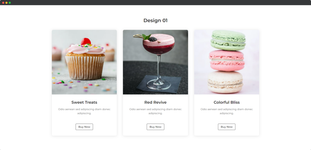
The Divi Info Card module for Divi Builder is a versatile tool designed to display information in a visually appealing card format. It allows you to combine text, images, icons, and buttons within a single card, making it ideal for showcasing features, services, products, or any other content that benefits from a structured presentation on your Divi website.

Live demo of the Info Card module.
Content
Content
- Use Icon – This option allows you to add an icon to the info card, enhancing the visual appeal and helping to represent the content or category the card is focused on. You can choose to enable or disable the icon depending on your design preferences.
- Select Icon – This setting lets you choose a specific icon from Divi’s library to be displayed on the info card. Selecting the right icon can help reinforce the message or theme of the card, making it more intuitive for users.
- Use Badge – This option allows you to add a badge to the info card, which can be used to highlight special features, statuses, or offers. The badge is a great way to draw attention to key aspects of the content.
- Title Text – This setting lets you add and style the title of the info card, which serves as the main heading. The title should be clear and concise, summarizing the content of the card effectively.
- Description – This option provides a space to add detailed text beneath the title, offering additional information or context. The description helps to elaborate on the title, giving users a better understanding of the content or purpose of the card.
Button
- Use Button – This option allows you to include a button within the info card, making it interactive and guiding users to take action, such as navigating to another page or triggering a specific function.
- Button Text – This setting lets you customize the text displayed on the button, ensuring it clearly conveys the action users will take when they click it. The button text should be concise and action-oriented to encourage engagement.
- Button Link – This option allows you to specify the URL or link where users will be directed when they click the button. The link should lead to relevant content or a target action that aligns with the purpose of the info card.
- Open the Button Link in a New Window – This setting enables the button link to open in a new browser window or tab when clicked. This is useful if you want to keep users on your site while they explore additional content, ensuring they don’t lose their place.
Design
Card
The Card design options allow you to style the overall appearance of the info card, including settings for the card’s background, border, shadow, and spacing. These options help you create a visually cohesive and appealing card that fits well within your page layout.
Image/Icon
The Image/Icon design settings enable you to customize the appearance of the image or icon displayed on the card. You can adjust the size, color, alignment, and other visual aspects to ensure the image or icon stands out and complements the content of the card.
Badge
The Badge design options let you style the badge element on the card, including its color, size, position, and typography. These settings allow you to highlight important features or statuses within the card, making them more noticeable to users.
Title & Description
The Title & Description design settings allow you to customize the typography, color, alignment, and spacing of the title and description text. These options help you ensure that the text is clear, readable, and visually aligned with the rest of the card’s design.
Button
The Button design settings provide control over the appearance of the button within the card, including options for button color, size, border, and hover effects. These settings ensure the button is visually appealing and encourages user interaction, seamlessly integrating with the card’s overall design.