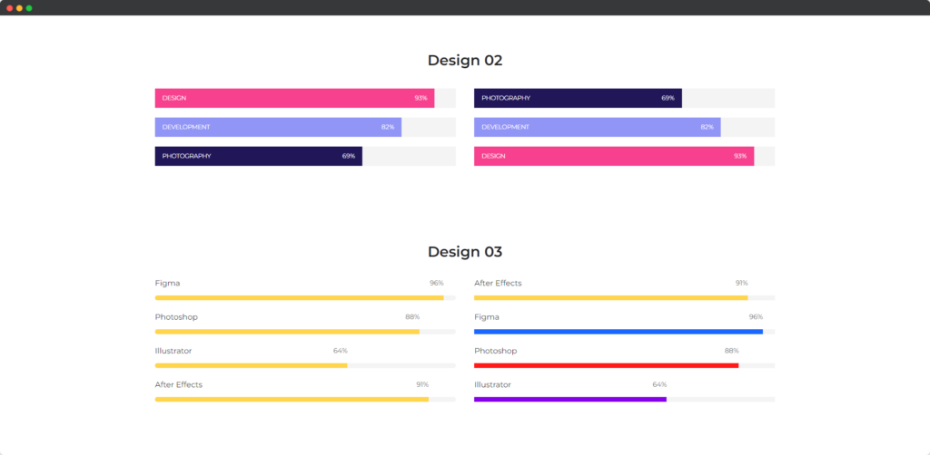
The Divi Progress Bar module for Divi Builder allows you to visually represent the progress or completion of a task, goal, or achievement. It’s useful for showcasing milestones, skills, or any quantitative progress in a visually engaging manner. The module offers customization options to fit the progress bars into your design and effectively communicate progress to your audience.

Live demo of the Progress Bar module.
Video
Short Intro of Progress Bar Module
Content
The content tab of the Progress Bar module.
Add Progress Item
Under the Content toggle
- Use Name – This setting allows you to display the name or title associated with the progress bar. Enabling this option ensures that a descriptive name is shown alongside or above the progress bar, helping users understand what the progress bar represents.
- Name – This option lets you specify the actual name or title to be displayed on the progress bar. It provides context or labels for the progress bar, making it clear what task or goal the progress bar is measuring.
- Level – The Level option allows you to set and display the current level of progress as a percentage or numerical value. This helps users see how much progress has been made toward the goal or milestone represented by the progress bar.
- Hide Level Text – This setting lets you choose whether to hide the text that displays the current level or percentage on the progress bar. Disabling this option hides the level text, providing a cleaner look if you prefer to show progress visually without specific numerical details.
- Text Placement – The Text Placement option allows you to control the position of the text relative to the progress bar. You can choose to place the text above, below, or within the progress bar, depending on where you want the progress information to be displayed for the best visual impact.
Design
Name Text
The Name Text toggle provides design options to customize the appearance of the name or title displayed alongside the progress bar. You can adjust the font style, size, color, weight, and alignment to ensure the name text is visually appealing and matches your site’s design. Options may also include text-shadow, letter spacing, and line height to refine the text’s presentation.
Level Text
The Level Text toggle allows you to style the text that displays the progress level or percentage. You can customize the font type, size, color, weight, and alignment, ensuring that the level text is clear and stands out. Additional design options may include text-shadow, letter spacing, and line height adjustments to enhance readability and visual impact.