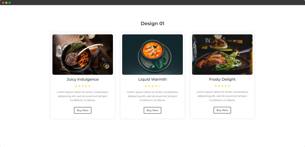
The Divi Review Module in Divi Builder is designed to display customer reviews or testimonials in an attractive and organized format. It allows you to showcase ratings, comments, and feedback from your customers, helping to establish trust and credibility with potential clients. The module offers customization options to ensure that the reviews blend smoothly with your site’s overall design.

Live Demo of the Review module.
Content
The Content tab of the Review module settings allows you to input and manage the review details, including the reviewer’s name, rating, testimonial text, and any associated images.
Content
- Rating Scale – Set the range of the rating system, typically from 1 to 5 stars, to define the scale used for customer feedback.
- Rating – Specify the numerical rating to display, visually representing the review score within the chosen rating scale.
- Show Rating Number – Choose whether to display the numerical value of the rating alongside the star icons for clarity.
- Upload Image – Upload a photo of the reviewer or related imagery to enhance the review and add visual authenticity.
- Open Photo in Lightbox – Enable this option to allow the uploaded image to open in a lightbox when clicked, providing a larger view.
- Image Alt Text – Add descriptive text for the uploaded image, improving accessibility and SEO by providing context for the image.
- Use Badge – Display a badge with the review, such as a label or certification, to highlight special recognition or achievements.
- Title Text – Set the title for the review, which could be the reviewer’s name or a summary of their feedback, styled to stand out.
- Description – Input the main body of the review text, where detailed feedback or comments are displayed, providing more context.
Button
- Use Button – Include a button within the review, typically linking to further information or encouraging action, such as reading more reviews.
Design
The Design tab of the Review module settings provides options to customize the appearance of the review.
General
The General toggle provides overarching design settings that affect the entire review module, such as background color, borders, and spacing. You can adjust these elements to ensure the review fits seamlessly within your website’s overall design. This section also includes options for customizing the layout and alignment of the entire module.
Rating
The Rating toggle allows you to style the star rating display, including the size, color, and spacing of the stars. You can also customize how the numerical rating is presented if displayed, ensuring it aligns with the overall design of the review module. This toggle ensures that the rating is visually appealing and easy to interpret.
Image
The Image toggle focuses on styling any images included in the review, such as the reviewer’s photo or a product image. You can adjust the image size, border radius, and shadow effects to make the image stand out or blend harmoniously with the rest of the module. Options to fine-tune the image alignment and positioning are also available.
Badge
The Badge toggle allows you to style any badges or labels associated with the review, such as highlighting a featured review or a certification. Customize the badge’s color, size, font, and positioning to ensure it draws attention while complementing the review’s design. This toggle helps emphasize special recognitions effectively.
Title
The Title toggle provides styling options for the review’s title, which could be the reviewer’s name or a summary of the feedback. You can customize the font, size, color, and alignment of the title to make it prominent and engaging. This ensures that the title stands out and captures the viewer’s attention.
Description
The Description toggle allows you to style the main body of the review text, adjusting typography settings like font style, size, color, and line height. You can also control the spacing and alignment to make the review easy to read and visually consistent with the rest of your site. This toggle ensures the text is both attractive and legible.
Button
The Button toggle lets you style any buttons included in the review, such as a “Read More” or “Visit Site” link. You can customize the button’s color, size, shape, and hover effects to make it visually appealing and encourage user interaction. This toggle ensures that the call-to-action button is prominent and enticing.