The Divi Telegram Chat module in Divi Builder adds a static chat box to your website that links visitors to Telegram Messenger. Although it doesn’t support direct real-time chat on the site, it offers a quick way for users to open Telegram and start live conversations, using the platform’s familiar messaging features for seamless communication.
The chat box in the Divi Telegram Chat module is static and does not facilitate real-time chatting. It’s designed to redirect to Telegram Messenger.
Intro Video
Telegram Chat Module
Content
This tab contains settings for the chat functionality, including the Telegram username, message text to pre-fill, and options to display the chat button. It allows you to configure how users will initiate contact through Telegram.
General
Telegram Username – Specify the Telegram Username to which messages will be directed from your website.
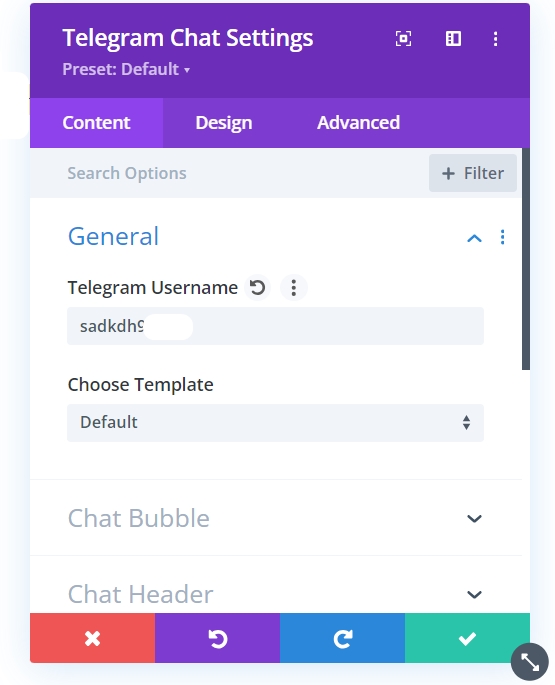
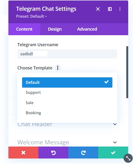
Template – The Divi Telegram Chat offers a variety of template options to enhance the user experience. Choose from a diverse selection of social chat interfaces to find the style that best complements your website’s design.
Chat Bubble
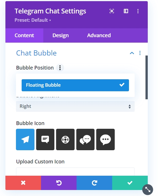
Bubble Position – Define the location on the screen where the chat bubble will appear.
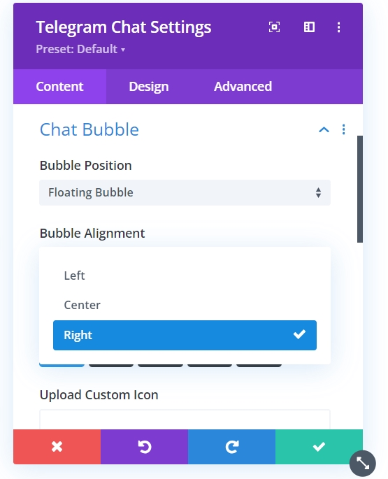
Bubble Alignment – Set the alignment of the chat bubble, ensuring it fits harmoniously within your site layout.
Bubble Icon – Choose an icon for the chat bubble from the default options provided.
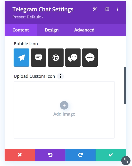
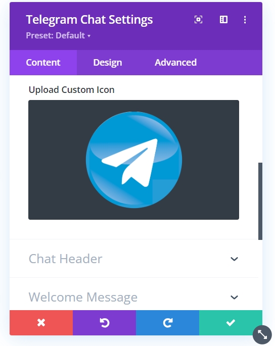
Upload Custom Icon – If the default icons do not match your branding, you have the option to upload a custom icon that represents your chat feature.
Chat Header
- Profile Name – Enter the name displayed in the chat header, typically representing the person or business users you will be chatting with.
- Profile Caption – Provide a short caption or status beneath the profile name, offering more context or information about the chat service.
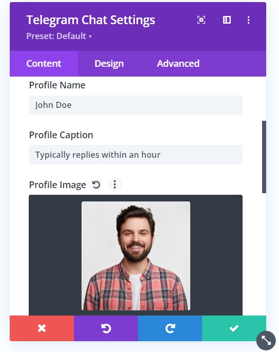
- Profile Image – Upload an image that will be used as the profile picture in the chat header. This can be a personal photo, a company logo, or a relevant graphic.
- Profile Image Size – Adjust the size of the profile image to ensure it’s properly scaled and visible within the chat header.
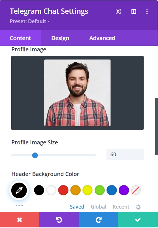
- Header Background Color – Select a color for the chat header’s background, which should complement your website’s color scheme and enhance the visibility of the chat header text.
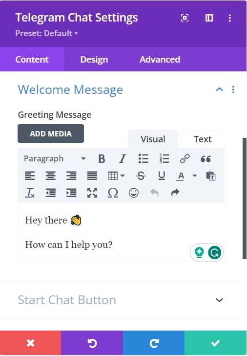
Welcome Message
Here you can craft the initial greeting or introductory text that users will receive when they initiate a chat session. This message sets the tone for the conversation and provides an opportunity to inform users about expected response times or to deliver a warm welcome.
Start Chat Button
- Start Chat Text – Define the label for the button that users will click to initiate the chat. This text should be action-oriented and inviting.
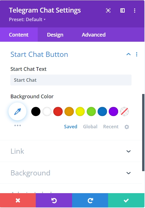
- Background Color – Choose a background color for the Start Chat button that stands out on your page, aligning with your website’s design while drawing the user’s attention.
Design
This tab provides styling options for the chat button and its associated elements, allowing you to customize the button’s appearance, including colors, sizes, and icons, to ensure it fits seamlessly within your website’s overall design.
Chat Bubble
This option allows you to customize the appearance of the chat bubble, including its color, shape, and size. Adjusting these settings ensures the chat bubble aligns with your website’s design aesthetics while remaining visually appealing and inviting for users.
Chat Header
This toggle lets you style the header section of the chat, including text color, font size, and background. Customizing the chat header enhances visibility and helps create a welcoming atmosphere for users initiating a conversation.
Welcome Message
Here, you can design the appearance of the welcome message displayed to users when they open the chat. This includes options for text color, font style, and spacing, ensuring that the message is engaging and clearly communicates your intent.
Start Chat Button
This toggle allows you to customize the style of the button users click to start a chat. You can modify its color, size, text, and hover effects to encourage user interaction and make the button prominent within the chat interface.